
Element Style Pane
Last updated:
The Style Pane is one part of Mermaid Studio’s visual editing workflow.
It is a property inspector in the Mermaid Studio tool window that lets you view and edit CSS styling for diagram elements without writing style or classDef lines by hand.
The preset strip in this recording predates Mermaid Studio 2026.4.0; see Style presets for the current layout.
Supported diagram types
Section titled “Supported diagram types”The controls the Style Pane shows depend on the active diagram type. The list below is generated from the plugin’s feature report; see each diagram-type page for the controls available there.
Support for additional diagram types will be added in future releases.
Opening the Style Pane
Section titled “Opening the Style Pane”The Style Pane appears as a Style tab in the Mermaid Studio tool window, typically docked on the right side of the IDE. Click the tab to switch to it.
Selecting an element
Section titled “Selecting an element”Place your caret on a styleable element in the editor, or click the element directly in the live preview. The Style Pane tracks your selection and displays the properties for the element under the caret.
When a styleable element is selected, the header shows the element’s icon (matching the structure view), name, and label (if any).
Selection persistence
Section titled “Selection persistence”Once an element is selected, the selection stays pinned through editor focus changes, caret movements off the element, and unrelated text edits. The pane no longer rebuilds or loses its active mode selector on every keystroke, and it refreshes after edits from the formatter, an inspection quick fix, or other non-typing edit paths.
Renaming a selected element follows through to the pane header and the preview highlight automatically; the selection clears only when the element is actually deleted.
The same pinning, rename following, and edit-driven refresh apply to Mermaid diagrams embedded in Markdown code fences.
Editing properties
Section titled “Editing properties”Properties are organized into collapsible groups.
Color properties display a swatch next to the value; click the swatch to open the color picker.
Dropdown properties like font-size and stroke-dasharray offer predefined values but also accept custom input.
Text and numeric fields commit on
Fill and Stroke
Section titled “Fill and Stroke”| Property | Description |
|---|---|
fill | Background color |
stroke | Border color |
stroke-width | Border thickness |
stroke-dasharray | Border dash pattern (solid, dashed, dotted) |
fill-opacity | Background transparency (0 to 1) |
stroke-opacity | Border transparency (0 to 1) |
Typography
Section titled “Typography”| Property | Description |
|---|---|
color | Text color |
font-size | Text size |
font-weight | Text weight (normal, bold, or numeric 100-900) |
font-family | Font face (generic or specific) |
font-style | Normal, italic, or oblique |
| Property | Description |
|---|---|
rx | Corner radius (horizontal) |
ry | Corner radius (vertical) |
The Other section is collapsible and accepts arbitrary CSS properties beyond the built-in groups.
| Property | Description |
|---|---|
opacity | Overall element transparency (0 to 1) |
cursor | CSS cursor style |
visibility | Visible, hidden, or collapse |
Property sources
Section titled “Property sources”The Style Pane shows where each property value comes from.
- Inline styles — From
style A fill:#f9fstatements. These have the highest precedence. When a property has a value to remove, the row shows an X button whose tooltip names the specific property (for example Remove Fill); the button hides itself when there’s nothing to remove. - Class definitions — From a
classDefapplied viaclass A myClassorA:::myClass. These show a source badge with the class name. Click the badge to navigate to the class definition, or click the unlink button to remove the class association. linkStyledeclarations — FromlinkStyle 0 stroke:#f00statements targeting the selected link by index.
When the same property is set in both a class and an inline style, the inline style takes precedence.
Style presets
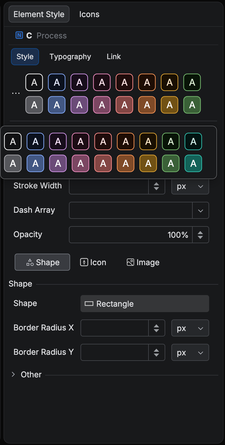
Section titled “Style presets”Above the property groups, the pane shows a strip of style presets for the selected element type. Presets are available for flowchart and swimlane nodes, subgraphs, and links, and for class diagram classes.
Every preset derives from the theme the diagram renders with, either the built-in Mermaid.js theme in effect or an applied custom theme.
The strip shows the first two tone rows cut to the pane’s width, and the All Presets popup shows every row.
Each column is a hue family named after the visible fill hue (Red, Gold, Teal, Blue, and so on) and each row a tone tier (Light, Mid, Dark), so a chip reads as Blue · Mid.
Each tier is derived lighter or darker than the theme’s own tone, so every label is readable against its fill.
One chip reproduces the theme’s own defaults and is labeled Slate (default) or the equivalent for the theme in effect.
A Neutral family completes the set, plus a maximum-contrast Black or White edge chip for links.
Themes whose nodes are a neutral surface with a colored border (the Redux family and the bundled dark variants) show an outlined identity row plus a Filled companion tier, named Teal · Filled.
When the diagram’s theme changes, whether by editing the frontmatter, applying a theme, or switching the appearance defaults, the strip regenerates from the new theme. The capture below shows the strip and the All Presets popup on a flowchart with the bundled Slate theme applied.
All Presets
Section titled “All Presets”The trigger at the left edge of the strip opens the All Presets popup with every derived preset and, under Custom, the presets you have saved.
Start typing to filter;
The plugin generates derived presets on the fly; the presets you save yourself persist.
Applying a derived preset writes the same classDef or inline style the pane would write by hand, so the result is plain Mermaid.
Color picker
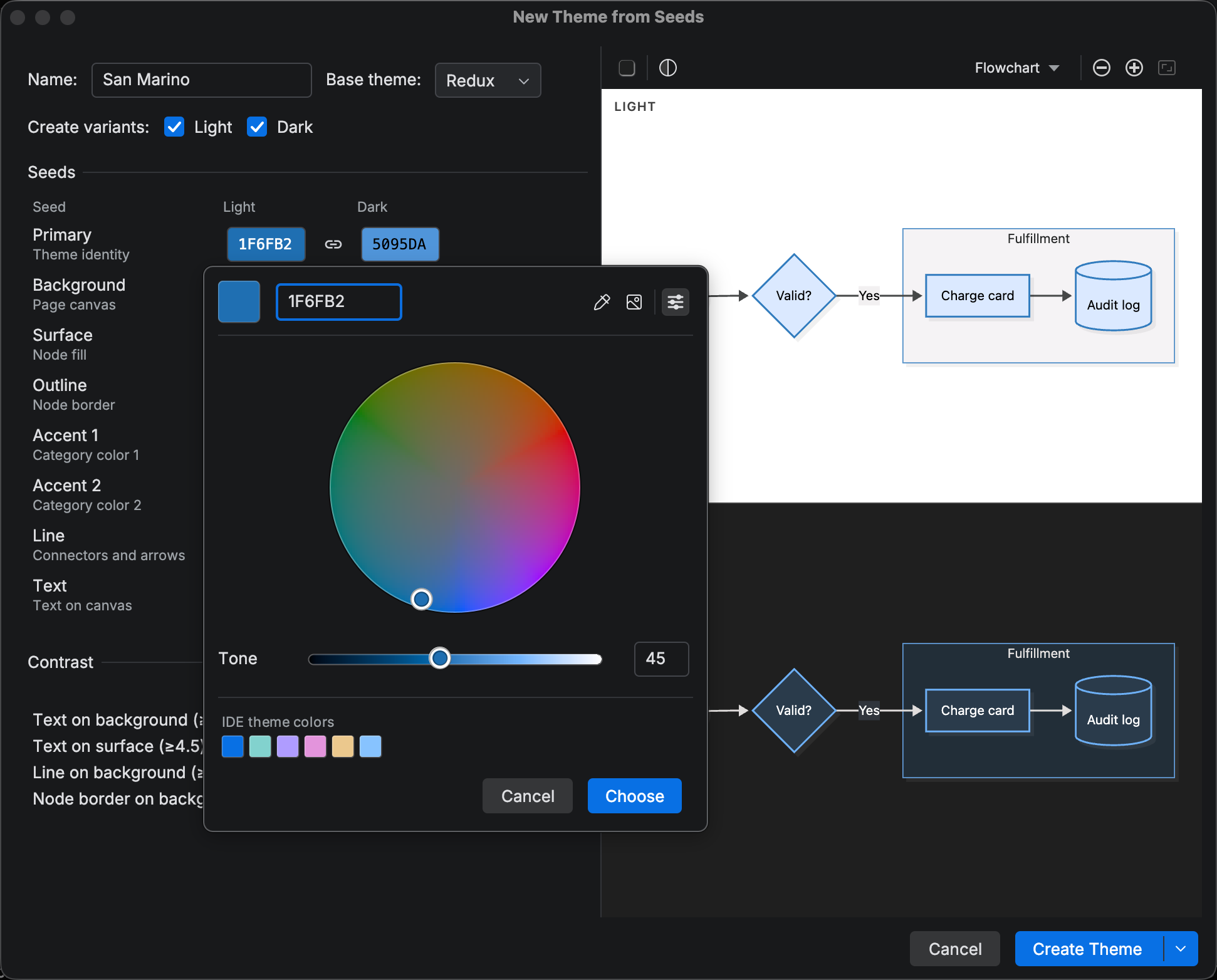
Section titled “Color picker”Clicking a color swatch opens Mermaid Studio’s HCT color picker in place of the IDE’s default chooser. HCT stands for hue, chroma, and tone. Moving the tone slider changes lightness without changing the hue you see, which is what tuning a palette usually calls for.
- Hex field and resolved swatch;
Enter Enter Enter Enter commits and closes the popup - Hue, Chroma, and Tone sliders with editable numeric fields;
Enter Enter Enter Enter in a numeric field applies without closing, andUp Arrow Up Up Arrow Up /Down Arrow Down Down Arrow Down nudge by one - Alpha slider for properties that accept transparency
- Pick Color from Screen, a pipette that samples any pixel on screen; the picked hex shows in a readout next to the cursor and applies on click
- Suggestion groups: Recently used (the last twelve picks on this machine), In this diagram (colors already assigned to the same property elsewhere in the diagram), and Theme palette (the derived preset values for the property)
If you would rather pick hue and chroma together, the Color Wheel button in the picker’s header swaps the Hue and Chroma sliders for a wheel drawn at the current tone, with the Tone slider below it.
On the wheel, the arrow keys move hue and chroma,
Without it, the picker shows a notice pointing to System Settings > Privacy & Security. The pipette button is hidden on Wayland sessions without XWayland.
Keyboard navigation
Section titled “Keyboard navigation”The preset strip is two focus stops: the All Presets trigger and the chip grid.
Arrow keys move between chips,
Section headers, the reset and unlink glyphs, and the source badges are focusable controls that respond to
All Style Pane changes integrate with the IDE’s undo system.
Press