
Live Preview
Last updated:
Mermaid Studio shows a live preview of your diagram alongside your code. As you type, the diagram updates automatically.
Opening the Preview
Section titled “Opening the Preview”The split editor with live preview opens automatically when you open a Mermaid file (.mmd or .mermaid).
If you only see the code editor:
- Click the split-view icon in the top-right corner of the editor tab
- Or go to View > Tool Windows and look for preview options
- Or right-click in the editor and look for preview options
Editor Layouts
Section titled “Editor Layouts”Use the layout icons in the editor toolbar to choose how the editor and preview are arranged:
- Side by side — Code on the left, preview on the right (default)
- Vertical split — Code on top, preview on bottom
- Preview only — Hide the code editor temporarily
- Editor only — Hide the preview temporarily
Toolbar Actions
Section titled “Toolbar Actions”The preview toolbar provides quick access to diagram configuration. These actions are available in both preview mode and edit mode. The Appearance and Layout dropdowns write their selection to the diagram’s frontmatter configuration.
Appearance
Section titled “Appearance”The Appearance dropdown combines the diagram’s theme, look, and font into a single menu. Each selection writes to the active diagram’s frontmatter, so it is saved in the file and overrides the render-wide appearance defaults.
The menu groups four controls:
- Diagram theme — the Mermaid.js color theme: Auto (default, follows the IDE theme), Default, Dark, Forest, Neutral, and Base, plus the Mermaid.js 11.14.0 Neo and Redux variants (Neo, Neo Dark, Redux, Redux Dark, Redux Color, Redux Dark Color) on diagram types that render them with explicit upstream styling. The list filters its options based on the current diagram type, so values that would render identically to the base theme are hidden. See Theme and Look compatibility for the full matrix.
- Custom theme — a swatch grid of the enabled custom themes, bundled and your own, with a Manage… link that opens the Custom Themes settings page. Picking a swatch writes the theme’s colors into the diagram’s frontmatter together with a tracking marker; see how a theme reaches the diagram.
- Diagram style — the rendering style (the look): Auto (default), Classic, Hand Drawn, or Neo. Like the theme tiles, the look options only show values the current diagram type supports, so Hand Drawn is hidden on diagram types that do not implement it. Neo was added in Mermaid.js 11.14.0.
- Diagram font — the diagram font: Auto (default), a web-safe preset (System, Verdana, Georgia, or Monospace), or any custom font family you enter.
When a control is left on Auto, the diagram inherits the adaptive appearance defaults configured for the Mermaid runtime. The Diagram theme and Diagram style headers show the value in effect, with a (default) suffix when it is inherited rather than set in the frontmatter.
When a custom theme is applied, the Custom theme section shows an Applied: theme name row and no built-in theme tile is highlighted; the custom swatch is the active selection. If the applied theme is no longer in your theme list (for example, a teammate applied it before sharing the file), the row reads Applied: theme name (not in the theme list) and the diagram keeps rendering from the colors stored in its frontmatter. To leave a custom theme, pick Auto or any built-in theme tile; that single edit removes the theme’s colors and the marker from the frontmatter.
The Light/Dark toggle at the top of the popup switches the diagram between its light and dark variant. For an applied custom theme it re-applies the other variant. Bundled custom themes switch variants in every edition; switching variants of your own themes needs a paid license.
Keyboard navigation
Section titled “Keyboard navigation”The menu opens with focus on the Light/Dark toggle.
Layout
Section titled “Layout”Switch the layout algorithm used to position diagram elements (for example, dagre or elk). This dropdown only appears on diagram types that support multiple layouts. Layouts beyond the default require enabling the corresponding engine in Mermaid Runtime settings.
Diagram Documentation
Section titled “Diagram Documentation”Opens the official Mermaid.js documentation for the current diagram type in your browser.
Zoom and Pan
Section titled “Zoom and Pan”Mouse Controls
Section titled “Mouse Controls”- Scroll wheel zooms in and out
Command Command Control Ctrl + scroll wheel zooms toward the cursor- Middle-click drag pans the diagram
Trackpad Gestures (macOS)
Section titled “Trackpad Gestures (macOS)”- Pinch zooms in and out
- Two-finger drag pans the diagram
Keyboard Controls
Section titled “Keyboard Controls”Command + 0 Command0 Control + 0 Ctrl0 fits the diagram to the viewportCommand + Shift + 0 CommandShift0 Control + Shift + 0 CtrlShift0 sets zoom to 100%Command + Plus Sign Command+ Control + Plus Sign Ctrl+ orCommand + Equal Sign Command= Control + Equal Sign Ctrl= zooms inCommand + Minus Sign Command- Control + Minus Sign Ctrl- zooms out- Arrow keys pan the diagram
Fit and actual-size also work from the source editor, so you don’t need to focus the preview first.
Toolbar Buttons
Section titled “Toolbar Buttons”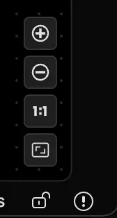
The zoom control bar provides five buttons:
- Zoom In and Zoom Out
- Zoom 100% — Actual size
- Reset — Fit the diagram in the viewport
- Fit Content — Fit the diagram with padding on all sides
A zoom indicator displays the current percentage briefly after each change.
You can configure the position and layout of the zoom controls in Preview settings.
Finding Text in Preview
Section titled “Finding Text in Preview”Press
Preview Context Menu
Section titled “Preview Context Menu”Right-click anywhere in the preview panel for quick access to:
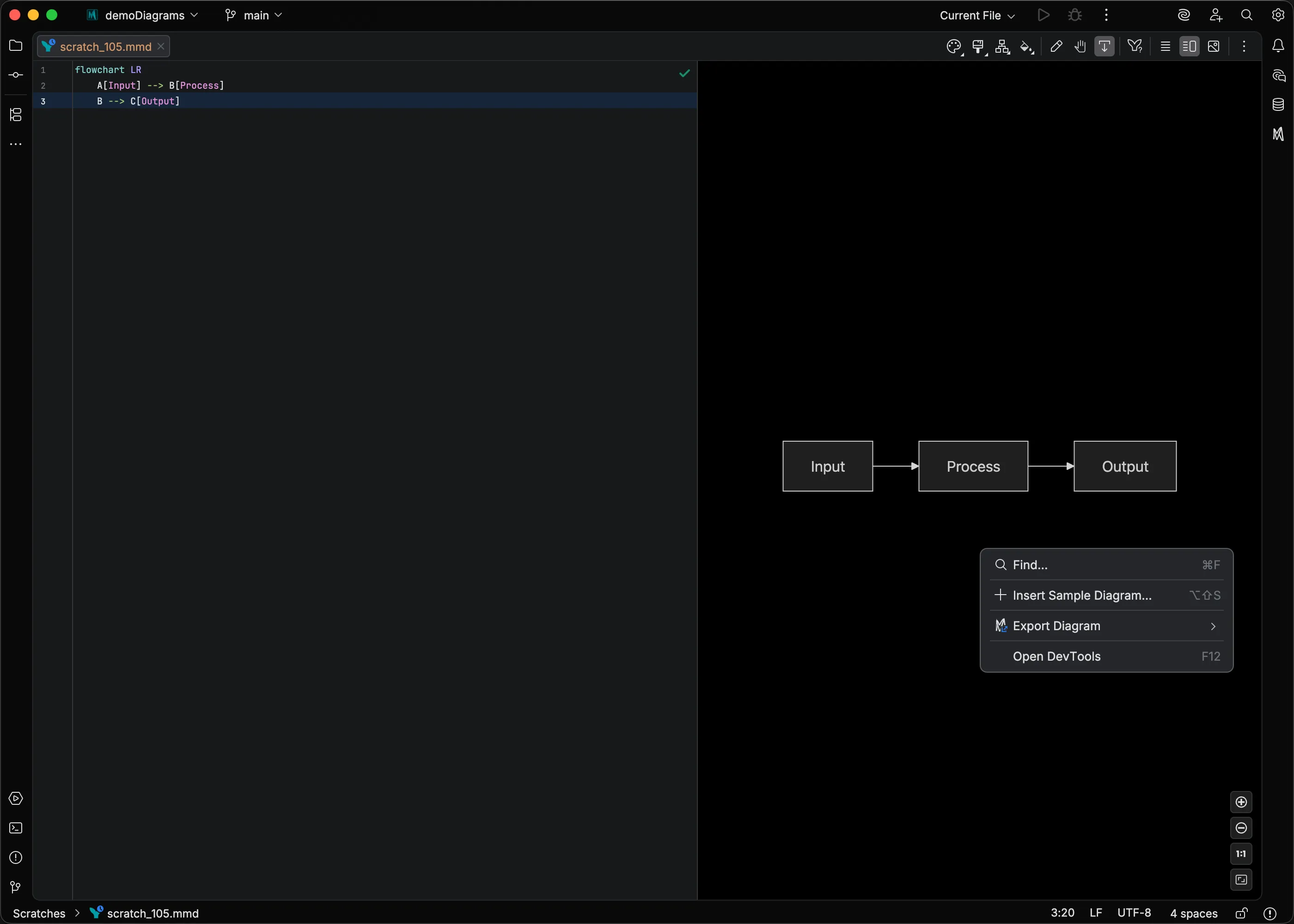
- Find in Preview — open the in-preview search bar (same as
Command + F CommandF Control + F CtrlF ) - Export Diagram — Copy as SVG, Copy as PNG, Export Diagram…, and Print Diagram…
- DevTools — open the embedded browser developer tools
The source editor’s context menu adds Switch Diagram Theme, a searchable popup for applying a built-in or custom theme to the current file; see Switching themes.
Light and dark rendering
Section titled “Light and dark rendering”Each kind of preview decides whether a diagram without an explicit theme renders its light or dark variant. The Appearance menu, the Switch Diagram Theme popup, and Match preview export, print, and copy all use that same decision.
- Standalone preview (
.mmdand.mermaidfiles) — follows the preview background setting. With Auto or Match Editor, the variant follows your IDE theme. With White or Black, the forced canvas decides, so a dark IDE with a White background renders the light variant. - Markdown preview — follows the IDE theme and ignores the preview background setting.
- Popped-out Markdown fence — renders as it did inline, following the IDE theme, while its runtime configuration overrides still come from the Preview context.
When you switch your IDE theme, previews that follow it update immediately. For dark themes where the background is too dark, you can enable Lighten Dark Backgrounds in Preview settings to improve visibility.
Edit Mode
Section titled “Edit Mode”Some diagram types also support direct manipulation in the preview — click to select elements, drag to move them, draw connections, edit labels inline, and restyle elements from the Style Pane. See Edit Mode for the full list of supported diagrams and actions.
Troubleshooting
Section titled “Troubleshooting”Preview shows “Preview not available”: Your IDE may not support JCEF (the embedded browser). This is rare on modern JetBrains IDEs. Try restarting your IDE.
Diagram does not render:
Check for syntax errors in your code.
Error messages appear in the preview panel.
Verify your diagram type keyword is correct (e.g., flowchart, sequenceDiagram).
Preview appears stuck: If a render takes too long, the preview shows an error overlay with a retry button. Editing the source code also triggers a fresh render attempt.
See Also
Section titled “See Also”- Edit Mode for interactive visual editing
- Style Pane for visual CSS styling of elements
- Preview Settings for appearance and control configuration
- Custom Themes for bundled and your own diagram themes
- Keyboard Shortcuts for a consolidated shortcut reference