
Custom Themes
Last updated:
Custom themes let you define a look for your diagrams once and apply it anywhere. Each theme has matched light and dark variants, and applying one writes plain Mermaid.js frontmatter, so a themed diagram renders the same on GitHub as in your IDE. Mermaid Studio ships eight bundled custom themes, free in every edition; building your own takes a paid license (Core or Studio); see Compare editions.
Bundled custom themes
Section titled “Bundled custom themes”Mermaid Studio ships eight custom themes, each with matched light and dark variants: Chalk, Iris, Islands, Moss, Neutral, Parchment, Slate, and Terracotta. The gallery below renders each theme on the same flowchart, one tab per variant, so you can compare them before opening the IDE.
Bundled custom themes render on the redux built-in theme by default (redux-dark for the dark variant), which adds drop shadows and stroke styling.
If you’d prefer the flatter base styling, the settings page can move the whole bundled library to it.
New from Theme Seeds in the Theme Generator opens any bundled theme with its seed colors filled in, so you can fork one.
Applying a theme
Section titled “Applying a theme”You can apply a theme from two places, and both write the same result into the diagram.
Appearance menu
Section titled “Appearance menu”The Appearance dropdown on the preview toolbar gains a Custom theme section listing every enabled theme as a color swatch chip. Click a chip to apply; the section then shows an Applied: (name) row, and the menu’s Light/Dark toggle switches the diagram between the theme’s variants.
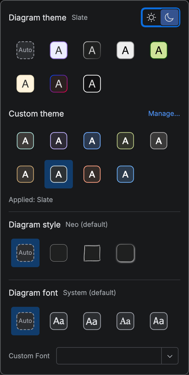
To leave a custom theme, pick Auto or any built-in theme tile. The plugin removes everything the apply wrote in one edit.
Switch Diagram Theme
Section titled “Switch Diagram Theme”Right-click in the editor of a .mmd file, or inside a Mermaid code fence in Markdown, and choose Switch Diagram Theme (it sits just below the Export entries).
A searchable Diagram Theme popup opens for the diagram at the caret.
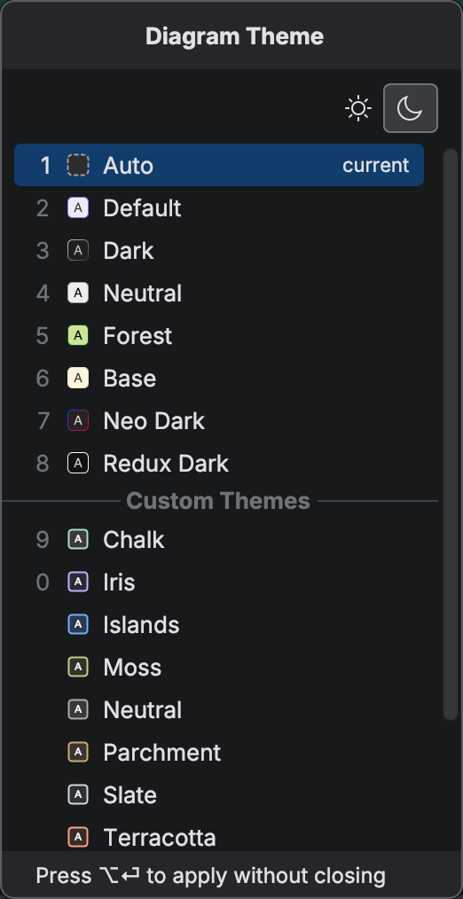
Type to filter, or press the digit shown next to any of the first ten rows to apply that row.
What applying writes
Section titled “What applying writes”Applying a theme inlines the resolved values into the diagram’s frontmatter as plain Mermaid.js configuration.
The plugin writes the built-in theme to config.theme, the theme’s variables for that diagram type to config.themeVariables, and a marker that records which theme it applied.
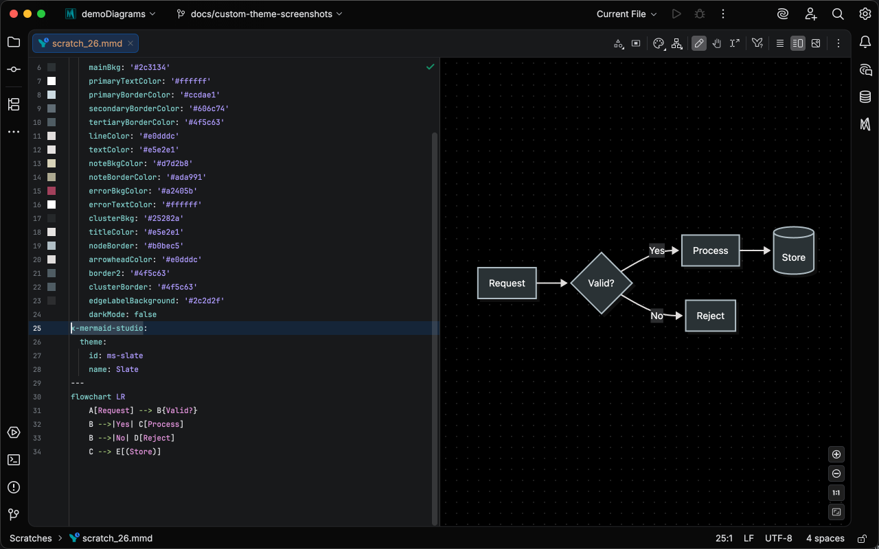
The frontmatter of a flowchart after applying the bundled Slate theme starts like this:
---x-mermaid-studio: theme: id: ms-slate name: Slateconfig: theme: redux themeVariables: primaryColor: '#eceff1' primaryBorderColor: '#223741' lineColor: '#454747' # ...---Everything Mermaid.js needs is in the file, so the diagram renders the same on GitHub and in other Mermaid.js tools. Nobody else needs the theme installed.
Mermaid.js and GitHub ignore the x-mermaid-studio key.
Mermaid Studio reads it to keep the Light/Dark toggle working and to show the theme’s name in the popups.
You can delete the marker by hand; the colors stay and the diagram becomes untracked.
Applying writes only the variables the target diagram type reads, so a flowchart and a sequence diagram receive different keys from the same theme. An apply writes literal values, so after editing a theme, reapply it to update an existing diagram.
Custom Themes settings
Section titled “Custom Themes settings”Open Settings > Tools > Mermaid Studio > Custom Themes to manage the library.
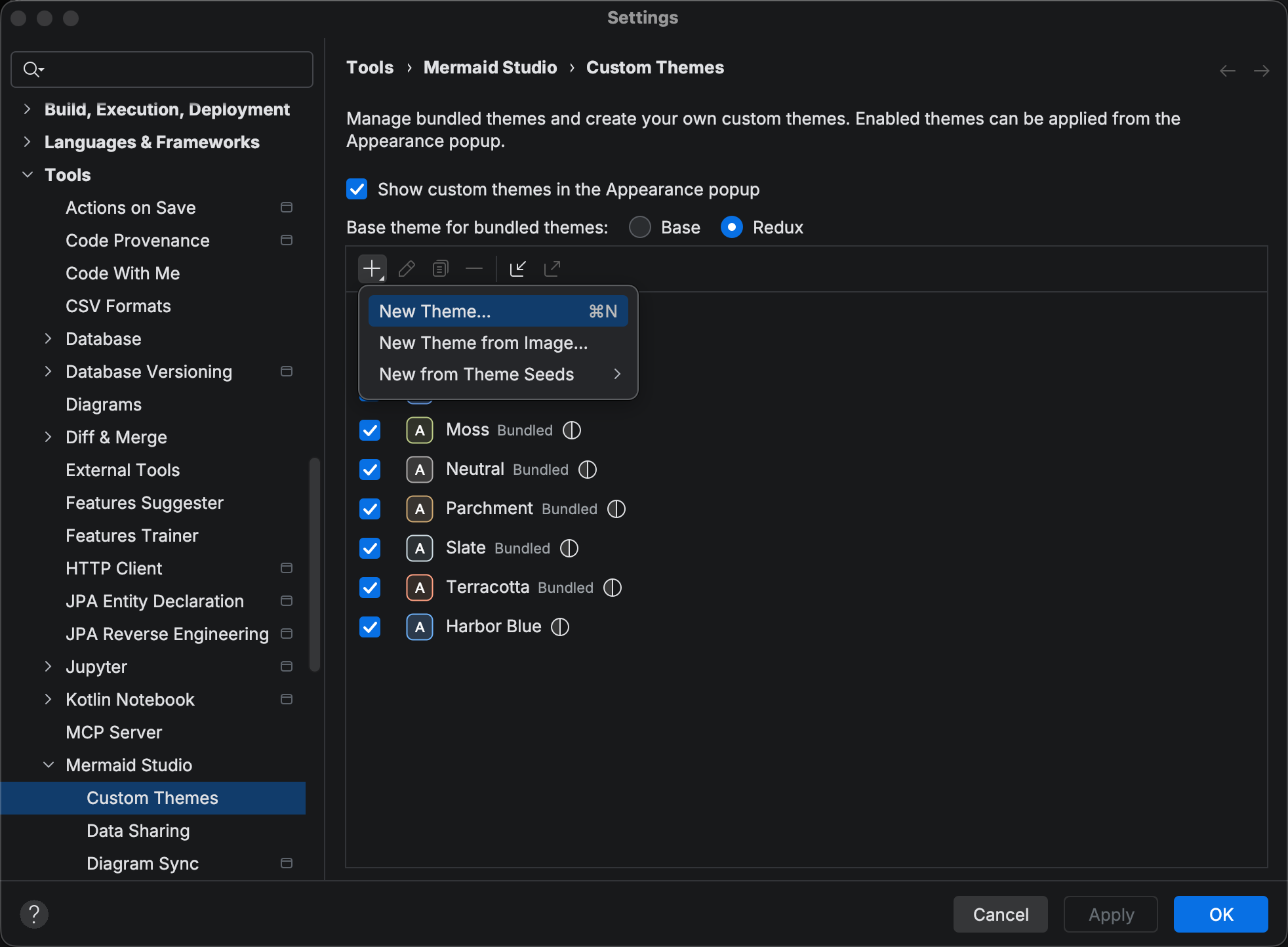
The page has three parts.
- Show custom themes in the Appearance popup — the master switch for the Custom theme section and the custom rows in the Switch Diagram Theme popup.
- Base theme for bundled themes — Redux (default) or Base, the built-in theme the bundled library renders on. Your own themes each store their own base theme; this switch has no effect on them.
- The theme list — one row per theme with an Enabled checkbox, a color swatch, the name, a Bundled badge on bundled rows, and an icon for which variants the theme has.
In the Add dropdown, New Theme… and New Theme from Image… open the Theme Generator, and New from Theme Seeds lists every theme that stores seed colors, bundled themes included. Bundled rows support Duplicate and Export; duplicate one to get an editable copy.
The plugin stores library edits the moment a dialog closes, so a new theme shows up in the popups without pressing Apply, and Remove asks for confirmation.
The IDE stores themes at the application level, not in the project; use export and import to move them between machines. See Import and Export for moving themes between machines.
Custom themes and the Style Pane
Section titled “Custom themes and the Style Pane”The Style Pane derives its style presets from the theme a diagram renders with, built-in or custom. Apply a theme and the preset rows switch to that theme’s colors.
Related
Section titled “Related”- Theme Generator — create a theme from seed colors or an image
- Theme Editor — fine-tune individual theme variables per diagram type
- Import and Export — move themes between machines
- Theme CSS — when you need CSS rather than colors
- Appearance defaults — the theme, look, and font used when a diagram sets none