
Theme Generator
Last updated:
You pick a primary seed color and the Theme Generator derives complete light and dark variants from it. Go further and customize any of the seven other non-primary seeds to shape a more complex theme.
The generated theme can be applied to nearly all diagram types supported by Mermaid Studio.
Opening the generator
Section titled “Opening the generator”All three entries in the Add dropdown on the Custom Themes settings page lead here.
- New Theme… — starts from a Primary color taken from your IDE theme’s accent, with every other seed on Auto.
- New Theme from Image… — asks for an image first (PNG, JPEG, GIF, BMP, or SVG, up to 20 MB), extracts up to eight distinct colors, and seeds Primary, Accent 1, and Accent 2 from the three strongest. The second color also seeds Surface. A logo or an app screenshot works well.
- New from Theme Seeds — lists every theme that stores seed colors, bundled custom themes included, and opens the generator with that theme’s seeds filled in.
Whichever entry you pick, the same New Theme from Seeds dialog opens.
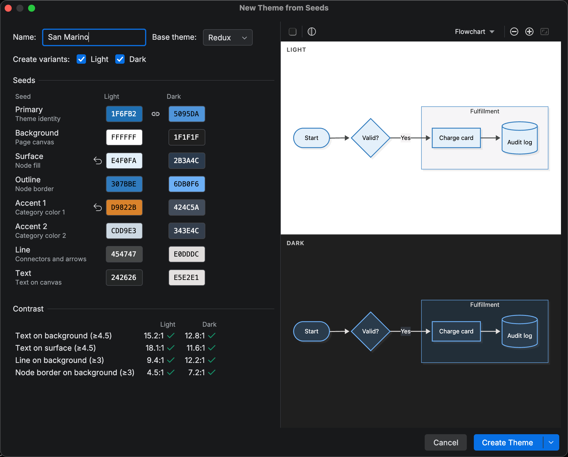
The Seeds grid has one row per seed and a Light and a Dark column. A cell is either explicit (a color you chose) or Auto (derived from the other seeds), and an explicit cell shows a Reset to Auto button. Most rows can stay on Auto.
| Seed | Role |
|---|---|
| Primary | Theme identity |
| Background | Page canvas |
| Surface | Node fill |
| Outline | Node border |
| Accent 1 | Category color 1 |
| Accent 2 | Category color 2 |
| Line | Connectors and arrows |
| Text | Text on canvas |
Primary matters most. It anchors the accent and border families, and the generated theme name comes from it. Surface decides the overall style. Leave it on Auto for a monochrome theme, give it a second hue for fills that differ from the borders, push it toward white for an outlined look, or toward black for inverted fills. The generator derives text on node fills from the fill, so labels stay readable on any accent.
The Primary row has a link toggle between its two cells. While linked, the light and dark variants share one hue and keep their own tone; unlink them to pick separate hues. For the other seeds, the color picker offers From light variant and From dark variant groups with an Adapted and an Exact version of the other column’s value.
Every cell opens the HCT color picker.
Name, base theme, and variants
Section titled “Name, base theme, and variants”The theme’s name is derived from the primary seed color by default and updates as you change seeds. Manually editing a theme’s name disables automatic naming until you reset the name field.
Set Base theme to Redux (default) or Base as the built-in theme applied alongside your custom theme. The base theme provides an overall rendering style and your custom theme provides the colors.
The Create variants checkboxes decide whether the theme gets a Light variant, a Dark variant, or both.
Preview and contrast
Section titled “Preview and contrast”The right side of the dialog renders a sample flowchart with the generated theme and updates as you edit, so you can see exactly how each change lands. The Look button next to it cycles Classic, Hand Drawn, and Neo, so you can check the palette in the looks you actually use.
The Contrast box estimates four pairs against WCAG targets: Text on background and Text on surface (4.5:1), Line on background and Node border on background (3:1). The estimate comes from the flowchart diagram type. The derived seed colors are optimized for readable contrast. If you’re customizing non-primary seed colors, check the diagram types you care about in the preview pane to verify contrast holds.
Creating the theme
Section titled “Creating the theme”Once you are satisfied with the generated theme, you have two options when saving your theme:
- Create Theme — stores the generated theme in your library and closes the dialog.
- Create and Refine… — stores the theme and opens it in the Theme Editor for adjusting individual variables.
A theme’s seeds are stored alongside the theme and can be reused as a baseline for new themes or to regenerate the theme later on.
Related
Section titled “Related”- Custom Themes overview — bundled custom themes, applying, and settings
- Theme Editor — fine-tune the generated theme
- Import and Export — export the result as JSON